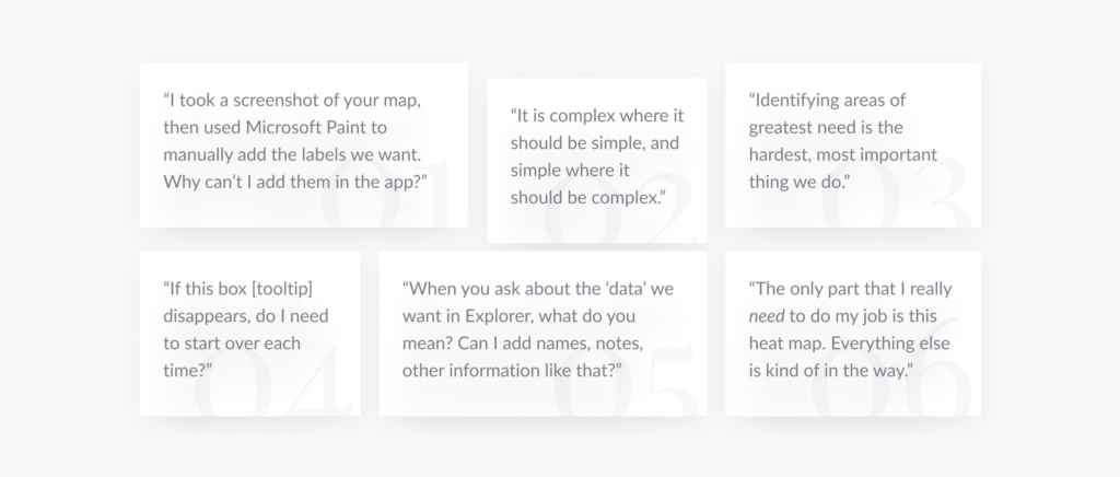
Understanding users in their home context.
UrbanFootprint Explorer’s Food Security Insights (FSI) tool is a data visualization product which maps food insecurity in relation to a wide variety of geographical and socioeconomic factors. At the time this study began in October 2022, Explorer was already in use at Louisiana DCFS and partner food banks. We had a top-down perspective of high-level tasks, concerns, and roles, but there remained a substantial amount of ambiguity around day-to-day operations within our customer and partner agencies.
Problem
Post-purchase utilization of our tools was low. We suspected that our actual end-users had different needs than their purchasing managers had described. Our understanding of user context lacked key information in several areas, including:
- tools and data currently in use
- changing goals moving into 2023
- established workflows, challenges, metrics, etc.
- technical proficiency, hardware in use (i.e. desktops, laptops, phones), and software specifications (i.e. browsers, operating systems)
- frequency/ease of communication with distribution partners
- size and location of offices
Solution
Combining in-situ user interviews, participant observation, and usability testing, we identified a number of needed quality-of-life improvements and high-value feature additions. We also reorganized the project creation workflow of our tools and made substantial changes to the language used to describe and discuss UrbanFootprint Explorer.
As a consequence, usage of our tools within organizations that already had access more than tripled over a 60-day period.
Methods
- User Interviews
- Participant Observation
- Usability Testing
- Reporting
User Interviews
Context & Script
Upon arrival at our customer offices in Louisiana, I conducted user interviews to establish baseline personas and to inform the later participant observation activities. I prepared an interview script with approximately 15 open-ended questions focusing on our target audiences’ concerns, motivations, and workflows. Over 5 days, I recruited and interviewed 7 users within their home contexts (approximately one office per day, spread across four cities in Louisiana). We referenced the user interview findings throughout the entire research process.
In most circumstances, we began with a tour of the facilities, including offices and (where relevant) warehouses and other infrastructure. Once the tour had concluded, we returned to an office or conference room to begin the semi-structured interviews.
I tried to initially frame this conversation as if I had just been hired to be an assistant to the participant — a classic framing methodology that reaffirms the user’s status as an expert and builds confidence and rapport. We did not begin by discussing UrbanFootprint’s tools at all, instead preferring to establish a foundational understanding of a participant’s typical collection of tasks. We also questioned participants about their goals for the coming year, changes expected in their workflows, and about their hopes for how their institutions could expand.
Powerhouse questions that generated substantial dialogue included:
- “If you could hire two or three more people, what would they be doing?”
- “What is the hardest, most frustrating thing about your job?”
Only once we felt that we had exhausted this line of questioning did we pivot to topics explicitly involving our products.
- How often do you use UrbanFootprint Explorer?
- If used often, to what extent?
- If used rarely, what prompts you to use it? Is it useful when you need it?
- If never or seldom used, what has stopped you?
- Do you find it useful?
- What is the least useful part of the application? The most useful?
- What is the most frustrating part of the application?
- How confident are you in using UrbanFootprint Explorer?
- Has using UrbanFootprint Explorer changed your work? How so?
- If not, can you imagine a world in which it could change your work? What would that look like?
- If you could magically add something to our maps, what would it be?
- In an ideal world, what else might a tool like ours provide?
In several cases, participants noted that they did not know what specifically they could use UrbanFootprint Explorer to do. This prompted another set of discussions, detailed in the full report.
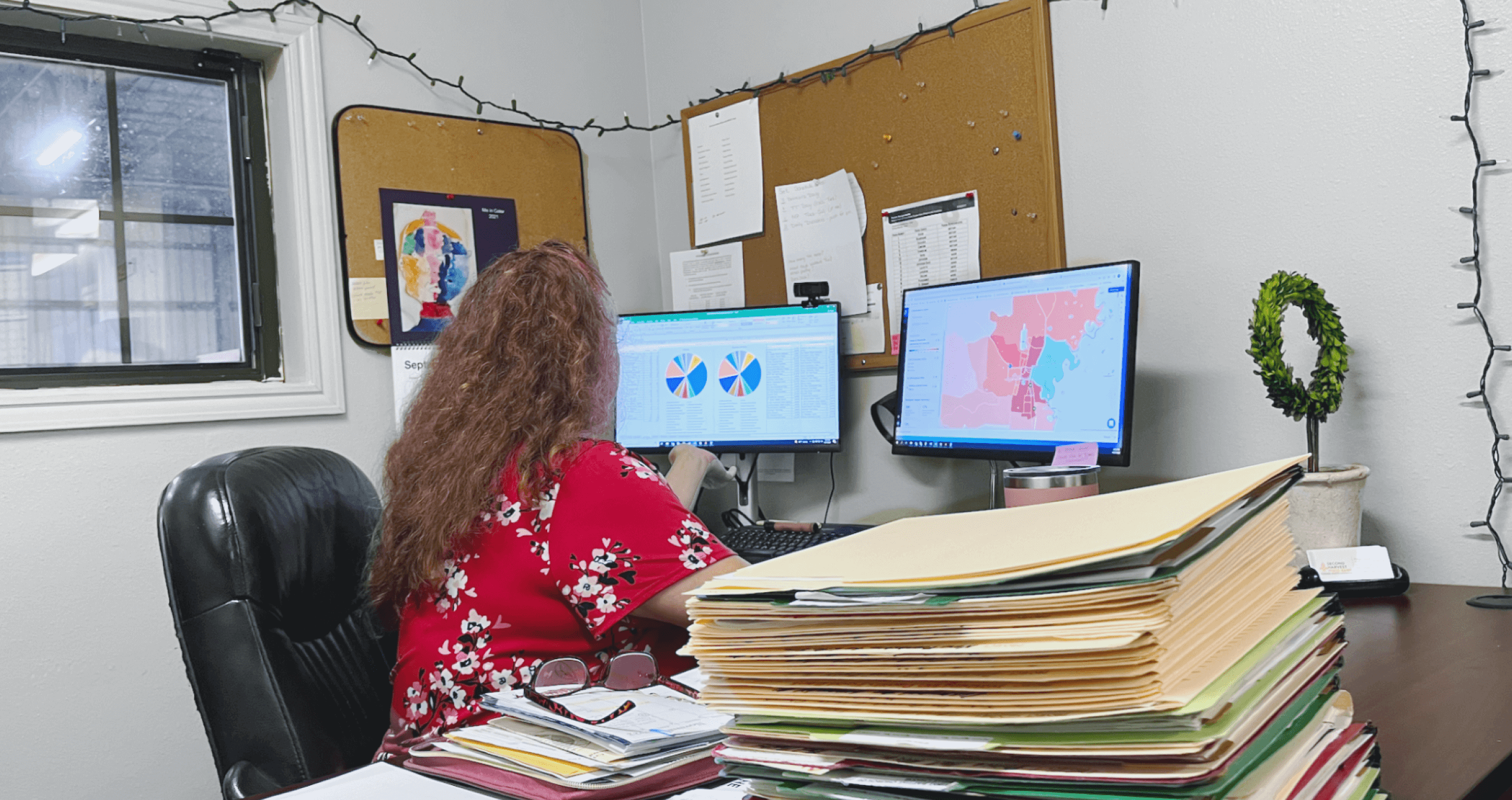
Participant Observation
Onsite in Louisiana
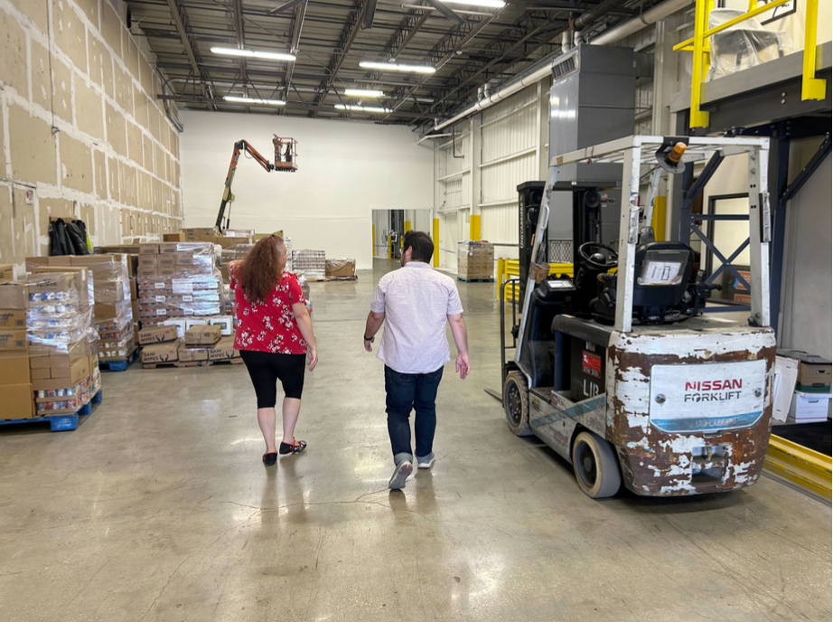
After an initial interview, I asked if I could observe the participants as they carried out their work. Once more, I asked that these participants imagine that I had just been hired as their assistant, or that perhaps I was being trained to take over their position after they had been promoted. In either case, the dynamic intended was: “I’m here to help, but you are the expert.”
I spent an average of four hours at each of our customer offices, watching as the participants went about their work. Occasionally, I asked questions to clarify what I was seeing, or to affirm if a situation was typical.
I made note of anything that did not align with my preconceptions.
Preliminary Findings
- Our users were fairly mobile, spending less than two hours per day at their desks on average. Much of their work was conducted on mobile phones.
- Our users had complex personal and professional networks which contributed far more knowledge to their assessments than our product.
- Much of the information our users relied upon was not represented in our tools. Some of this knowledge could easily be incorporated into our product.
- Most organizations had one or two “power-users” of Explorer who saw the potential of the tool. They were often the resident data analysts and served as advocates for our product.
- Our participants typically focused on relatively small geographical areas of concern, rather than the high-level views of county/parish information presented in Explorer.
- There was a stark mismatch between the vocabulary our users used in describing their work and that which we had put into our application. The cleanest example of this is the word “data,” which had a tendency to intimidate users who otherwise had a deep, comprehensive understanding of their communities and the intersectional factors that influenced them. Put simply, what we called “geographic and socioeconomic indicators of health and resilience,” our users just understood as “information.”
- There were several use cases that we had never considered at all. Notably, grant-writers needed the kinds of data presented in Explorer to apply for government funds, but this data was often not exportable in a way they could use.
Usability Testing
Onsite and remote
In addition to the production instance of Explorer that users already had access to, we created partially-functional, medium-fidelity prototypes of new workflows using Adobe InDesign. Before beginning fieldwork, we started recruiting subjects for usability tests who fit our criteria. We did 6 remote usability tests (using UserInterviews for both sourcing and interaction) in the first round and 3 more after iterating. By this point, we were ready to demonstrate some of these concepts in-person while visiting customer offices.
Several issues were identified, and solutions proposed.
Preliminary Findings
Issue 1
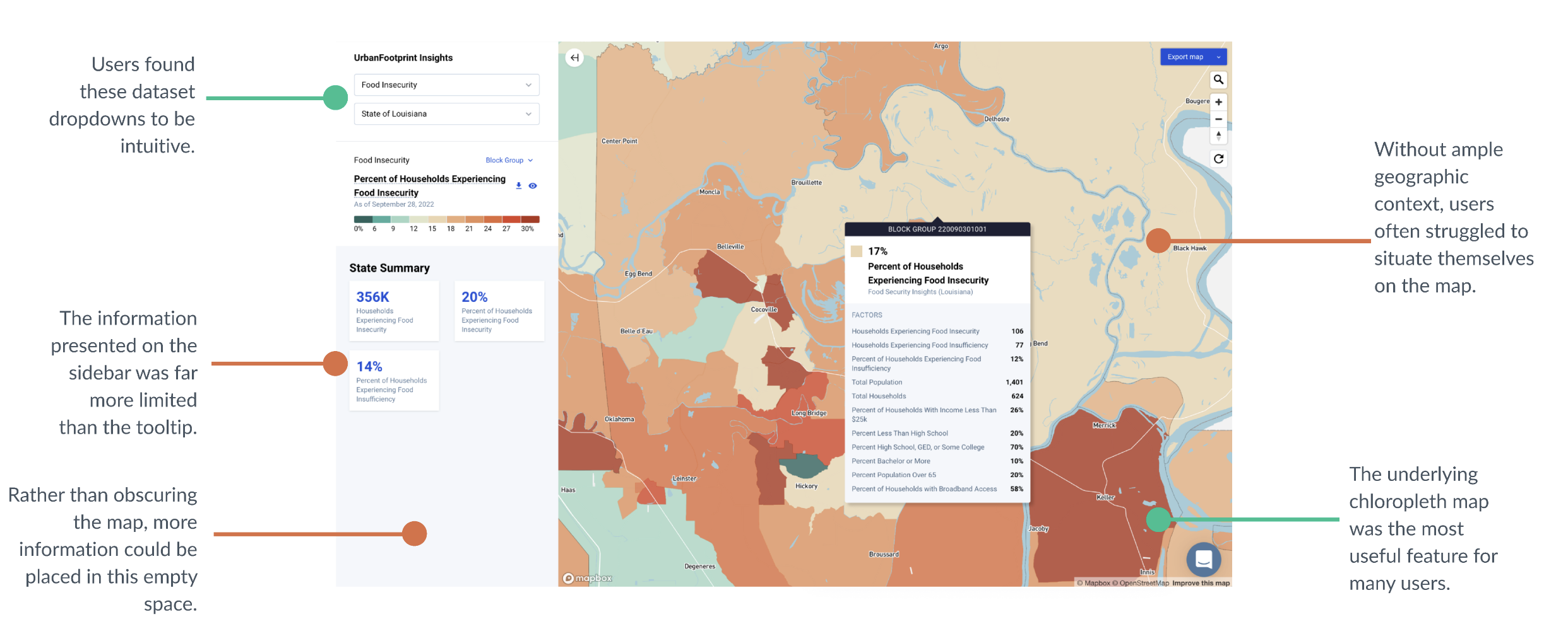
Tooltip Placement & Behavior
Users instinctively clicked on areas of interest. This action prompted our tooltip, which contained most of our data, to appear over that area. The tooltip filled a large portion of the screen, with no obvious way to remove it. Mousing over a different geographical area caused a new tooltip to pop up for that area.
If a user wanted to look at the underlying chloropleth map, the best way for them to do this was to “lock” the tooltip someplace away from where they were looking, then pan the map over to their area of interest.
This was a cumbersome and hackish process, and it led our users to feel that they did not really have control over how to display areas of interest in Explorer. This issue was further complicated by the fact that many of our users explicitly voiced the desire for more information to be presented at all aggregation levels, a change that would make the tooltip even larger.
Another issue identified is that information in the tooltip is often not actionable in that you cannot compare context attributes between two or more geographies without a pen and paper.
Solution
Incorporate tooltip information into the sidebar or otherwise along the side of the map. Keep the map visible and unobscured whenever possible. Investigate methods of comparison between geographies.
Issue 2
Local Geographical Context
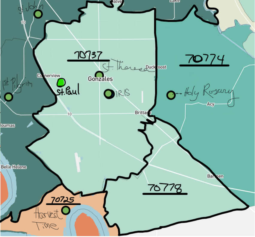
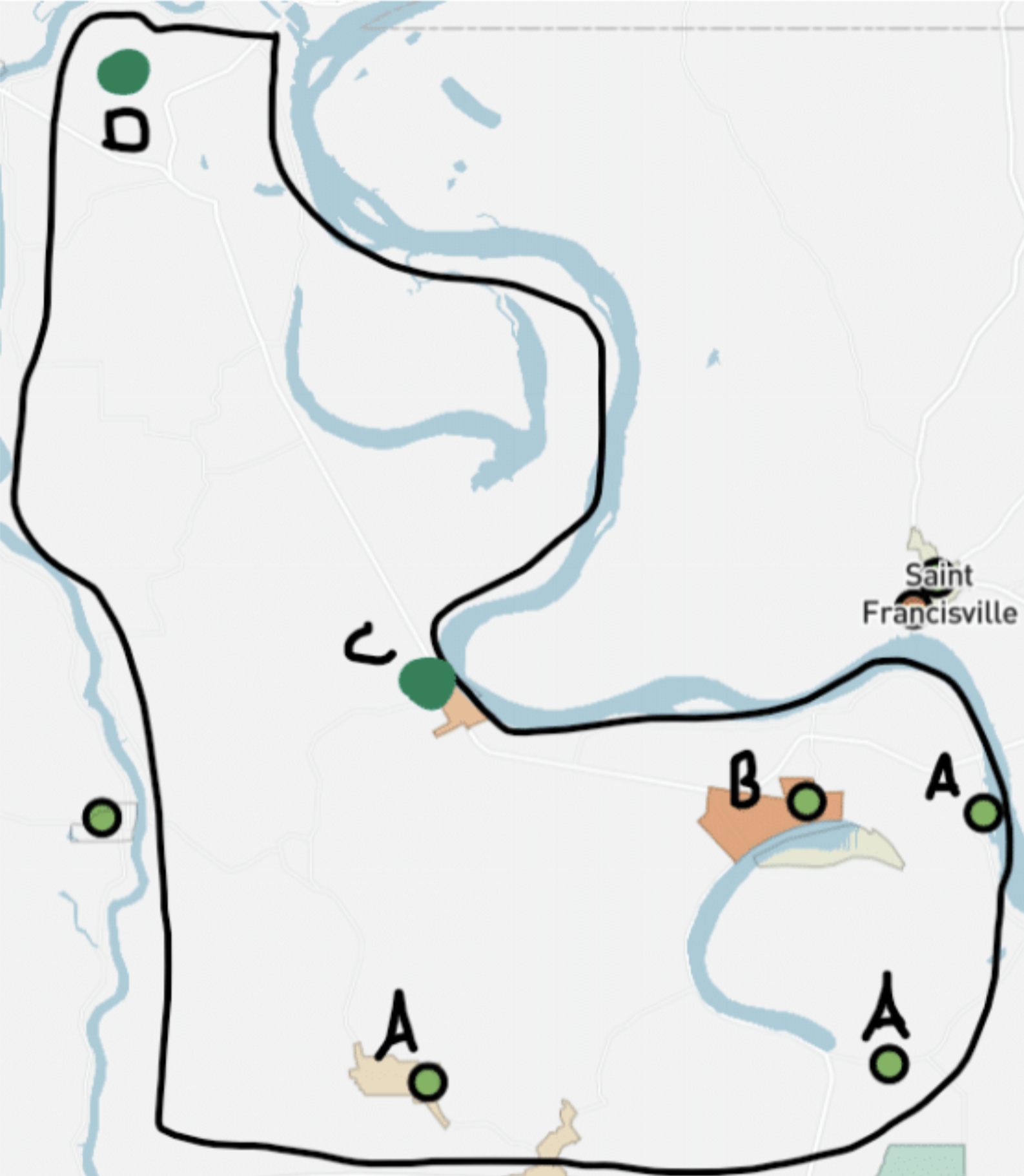
Our users tended to have a different conceptualization of local geography than that represented in our product. While it may not ever be possible to create a perfect representation of a given organization’s idiosyncratic (and often unofficial) community boundaries, users should be able to orient themselves on the map with landmarks other than roads and census-designated community names.
Churches, schools, government buildings, and retail outlets often serve as ground-level indicators of place, as well as community outreach locations and potential partners. These landmarks were largely absent from our maps, pushing users toward workarounds such as opening Google Maps in another window and looking at both maps in tandem, flipping back and forth until they felt confident that they understand where they were looking.
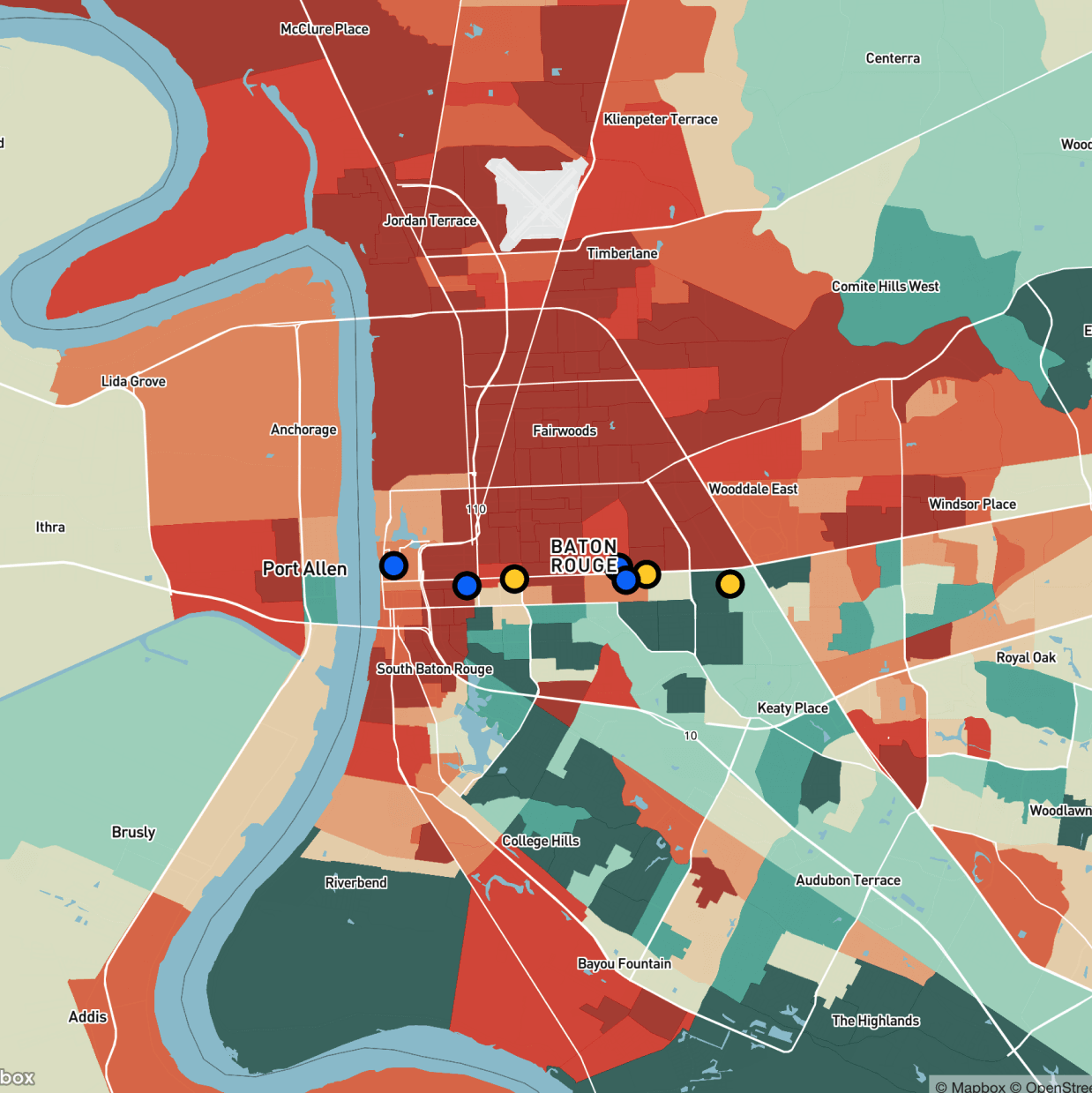
In addition, user-created content, such as the map show here, indicated a strong need to include partner organizations as de factolandmarks, given that these were used internally in strategic contexts.
Solution
Add more locally-identifying information to maps at progressive zoom levels, and make it easier and more expedient for users to add their own landmarks. If possible, allowing for the addition of metadata (such as hours of operation, key contact information, etc.) would also improve this experience.
Issue 3
Map Refresh on Exhibit Change
Changing an “exhibit” (the dataset populated and displayed on the map) caused the map to refresh and reset to a state-level zoom (Louisiana, in the case of participants in this study).
This design decision was made on the assumption that analysts would typically be concerned with high-level statistics and parish-to-parish comparisons. However, it became clear in our tests that our users were more concerned with local areas near their offices, or areas in which they had partner offices.
If they wanted to make a like-for-like comparison between two different exhibits (e.g. households experiencing food insecurityand households greater than 2 miles from a grocery store), they were forced to reorient the map to the area they had previously zoomed into.
Aside from being cumbersome, this also ignored the possibility that a user might not remember how to “get to” the place they were just looking at. It also made exporting multiple, comparable screenshots of different metrics difficult to do without the maps being slightly different.
Solution
Maintain geographical zoom when changing exhibits, or otherwise allow users to “save” zoom levels as custom map views.
Reporting
At the conclusion of this study, a full report of these (and other) findings was published and distributed organization-wide. This report detailed the context, research scope and approach, key findings, and general UX observations and recommendations, as well as logical next steps for further research.
Product managers responsible for advocating for the changes laid out in the report were the primary audience. With their support, we were able to implement many of the recommendations within a few months. Additionally, some specific segments were heavily used by my colleagues in marketing, engineering, design, and at the strategic level.
The full report is available to view at the link below, shared with permission from UrbanFootprint.
Next Steps
Based on the fieldwork and testing completed, I made the following recommendations.
Research
- Investigate the needs of grant-writing users
- Research better interaction methods for pan-and-zoom on a map, while dynamically displaying information in a sidebar and tooltip.
Product
- Create a tool for adding custom points of interest and other context to maps.
- Viewport in Explorer should not reset upon changing an active exhibit group.
Customer Success
- Help documentation and seminars should reflect actual user vocabulary (e.g. “information” rather than “data”) and rely less on technical vocabulary.
- Users should be encouraged to explore data intersectionality, which may entail periodically re-hashing the data available to them.
Personal UX Takeaways
- Purchasing managers may have an incomplete (or completely flawed!) understanding of the needs of their colleagues. Do not rely exclusively on documentation produced during sales discussions as specifications for a product.
- In-person ethnographic studies remain the best way to gain a visceral understanding of a user’s context, but usability testing is relatively unhindered by remote means.
- It always pays to remind the users that they are the expert, and that our job is to advocate for their needs. People want to help and like to be heard.

Thank you for reading my case study!
If you think that I could be an asset to your organization, or you are looking for a partner in a new venture, please do not hesitate to reach out.
Storytelling — humanizing data and abstract information — is what I love to do.