Reimagining a B2B Data Visualization Product

The Problem
JLL China’s research deliverables needed a complete overhaul.
- The number of paying subscribers had stagnated as fewer businesses made their first entry into China.
- Server logs revealed that, in many cases, subscribers paying for data on 20 cities would frequently ignore all but one or two. In other cases, the reports went completely unread, despite being the main source of actual analysis.
- For subscribers relying on the datasets (in the form of complex Excel workbooks), many of the major indicators were misunderstood or underutilized.
- A number of boutique data visualization firms had begun operating in China, providing bespoke, project-specific analytics for approximately the same cost as a subscription to our service.
In sum, we had reasonable concern for the future of our research practice in a changing business environment with increased competition. We were losing our edge.
The Solution
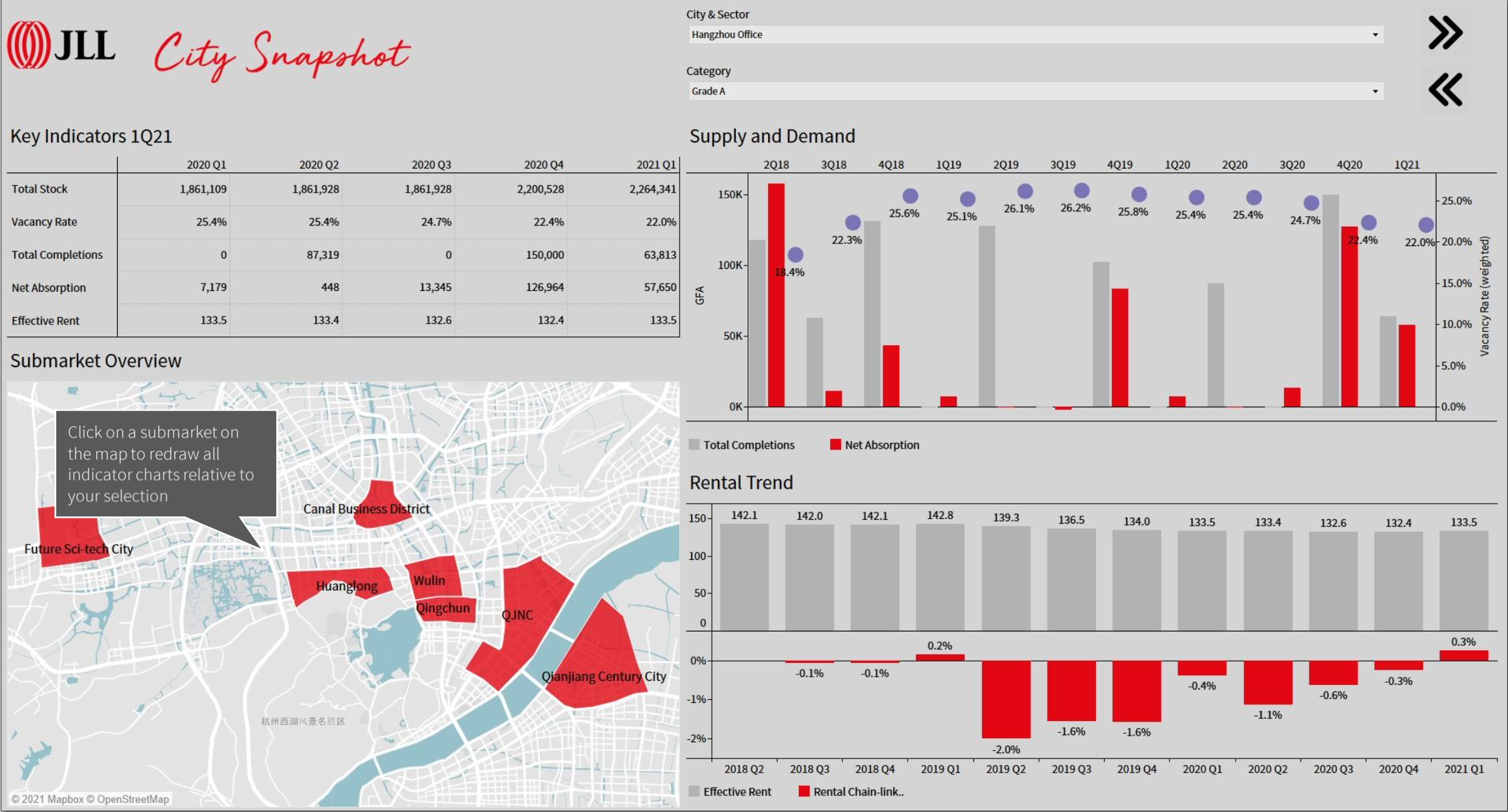
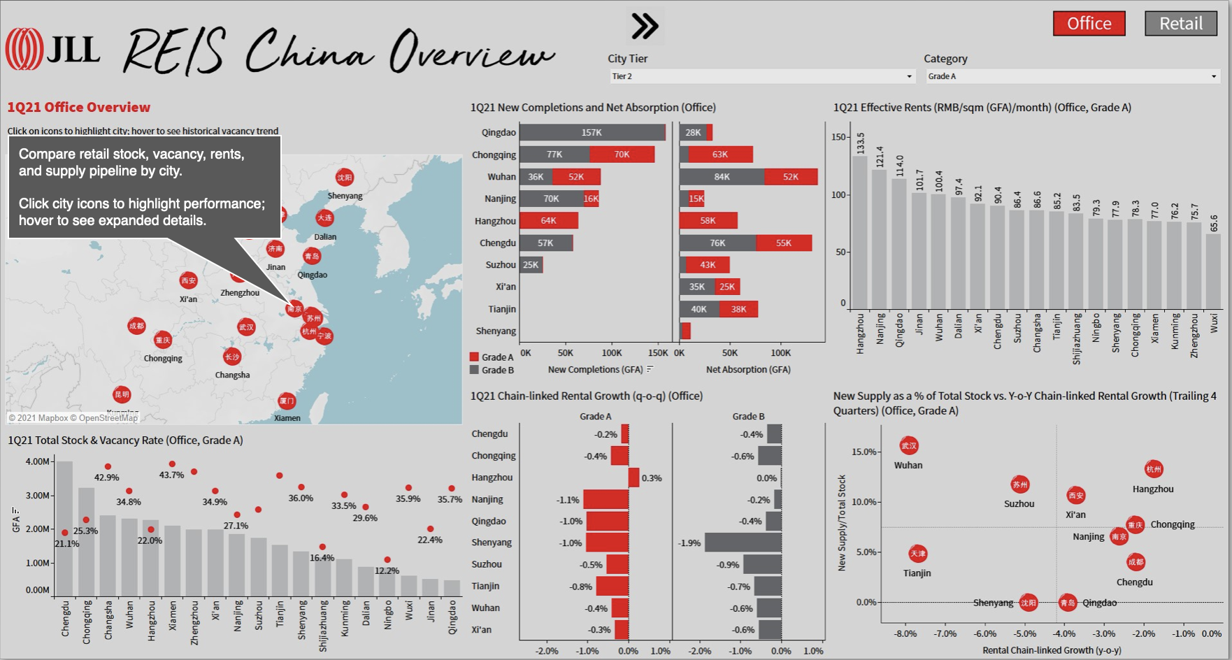
We reimagined the form our deliverables would take from the ground up. Using Tableau, we built beautiful, functional dashboards that allowed for both casual presentations and intensive data analysis.
None of the key indicators from the original deliverables were lost in this transition to a more streamlined tool. On the contrary, we built our new product (called City Snapshot) with an eye toward inter-city comparisons, a form of analysis completely absent from the traditional REIS deliverables, which assumed that a given analyst was only concerned with one real estate market at a time.
Within two quarters of the launch of City Snapshot, REIS saw an increase in the number of paying subscribers for the first time since 2012. Within a year, the number of subscribers had doubled. City Snapshot also saw substantial use within JLL for internal analysis and sales presentations.
Methods
- Client Interviews
- Contextual Inquiry & Task Analysis
- Card-sorting
- Prototyping & Benchmarking
Phase 1: Discovery
Client Interviews
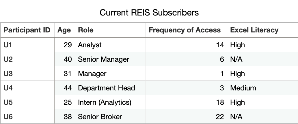
Participant Selection
Six participants were chosen. The following qualifications were used:
- Location: Shanghai
- Current REIS subscriber
- Represented a team that had accessed the REIS portal at least once in the previous four quarters
Interviews were scheduled based on availability and existing client relationships. Age and role were collected, along with data on how frequently their company/team had accessed the REIS data portal. Users were asked to self-report Excel proficiency.
Interview Topics
Interviews took place in the participant’s workplace, typically in a meeting room. Discussions were framed as an opportunity to reshape REIS products to more directly suit the needs of these participants.
Present in the room were the participant, myself, an assistant manager, and one intern. All parties were encouraged to ask follow-up questions, and conversations were recorded on my iPhone.
- For what tasks do you use REIS data/reports?
- Where do you start when opening the data/reports?What is the first thing you need when they become available each quarter?
- Aside from REIS, do you use any other data sources for your work?
- If we ceased coverage of (your city), how would that affect your work-flow?
- Is there anything you think we could improve?
Conversation typically drives away from a rote question-answer format. Participants were encouraged to speak candidly. Later, our intern transcribed sections of the interviews for use in presentations to management on the business necessity of a REIS refresh.
Contextual Inquiry & Task Analysis
Contextual Inquiry
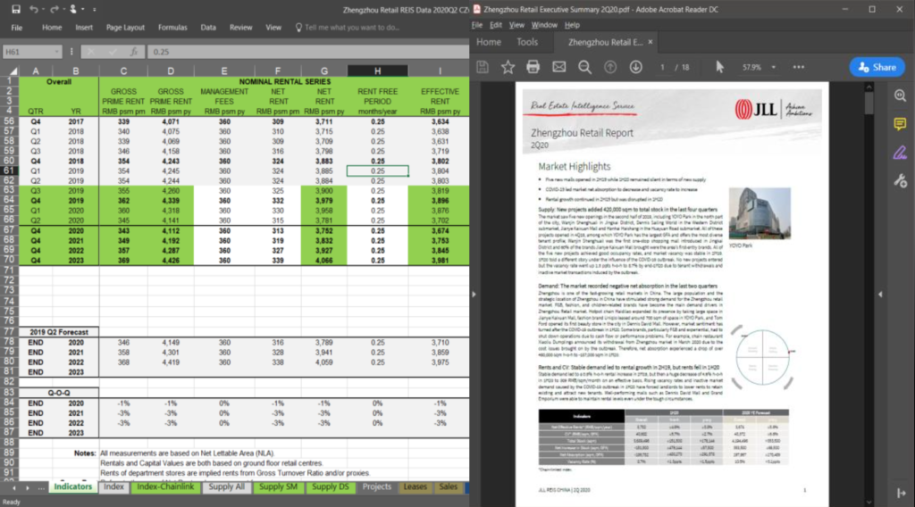
Participants were invited to walk us through how they used the REIS deliverables, starting with the act of opening a browser, navigating to the REIS portal, and downloading the Excel and PDF files.
From there, the participants demonstrated what they actually did with the data and reports. In some cases, this involved more complex data analysis. In others, pulling out quick summaries for sales presentations. One participant honestly answered that he would then email the Excel workbook to an analyst on his team who would “do her thing.”
The three JLL representatives in the room (the assistant manager, the intern, and myself) all asked questions as the participants performed their typical workflows. Before the study, I had briefed my team on the kinds of questions to ask. Basically: In what ways do participant workflows differ from how we would do the same thing?
This process revealed a huge degree of tacit knowledge. Given that our intern was new to the field of commercial real estate analysis, her questions illuminated the amount of implicit knowledge that was requested to work with the REIS deliverables, including the disconnect between standard vocabulary and industrial jargon.
The questions asked by our assistant manager (on the right) were especially pointed.
Ultimately, we were left with one sobering impression: Our users did not understand the data we were being paid to provide.
“Why did you export the existing stock, but not new supply? The stock is unchanged from last quarter.”
The participant was unaware of the difference between stock and supply.
“Why are you using spot rental growth instead of the chain-linked rate?”
The participant did not know the difference.
“Do you ever get any errors when you paste from the Summary tab?”
The participant was pasting formulas rather than special-pasting the values alone, guaranteeing that their financial models would be invalid.
Task Analysis
An intern was instructed to make note (either by hand or on a computer, depending on the participant location) of every change of “tab” (Excel worksheet) or page in a PDF report as a participant was completing their work.
These notes were later collated for analysis.
This process revealed a number of surprising insights. No two participants had the same (or even largely similar) path through the REIS deliverables. Participants that had self-reported as adept Excel users made the same kinds of mistakes that relative novices made.

Phase 2: Design
Having established the need for a refresh of the REIS deliverables, including adding new analytical methods, we moved into the process of ideating and designing a data visualization tool. Our goal was to replicate all analysis present in the original deliverables, but to do so in such a way that novice analysts were just as capable as advanced ones.
Card Sorting
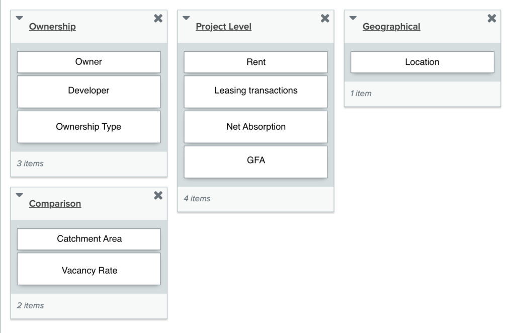
To make sure that our internal information architecture was aligned with user expectations, we had 6 remote card sorting sessions using OptimalSort. Our goal was to find smaller, intuitive groupings for the existing 36 key indicators used in REIS.
After organizing the data, we ended up with 6 clearly defined main categories with 4-7 subcategories in each.
Participants were instructed to create their own groupings of the indicators used, ignoring those that were irrelevant to their work.
Prototype Benchmark Testing
We created several dozen interactive wireframes using Sketch as our data analysts prepared the underlying backend data using SQL.
(Unfortunately, I no longer have many screenshots of our early Sketch mock-ups.)
Internally, we assessed usability by benchmark testing. Participants (typically, from sales or other non-technical departments) were tasked with identifying certain key indicators. I timed each test and randomized exposure to different designs.
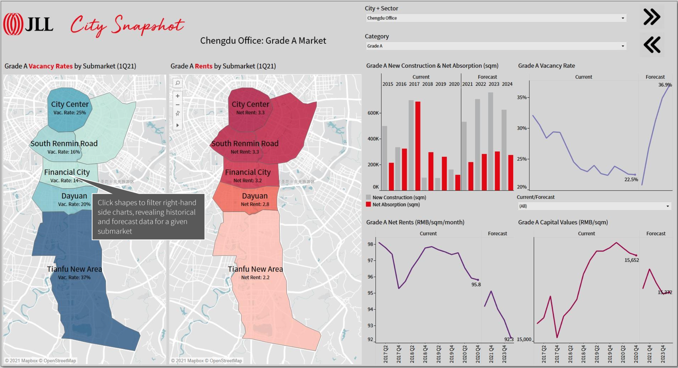
By the time the backend SQL tables had been prepared using Tableau Data Prep, we had settled on a preliminary wireframe that included two drop-down menus in the upper-right corner and five pages. We began building a functional product in Tableau.
While we initially chose a dark theme, eventually JLL’s corporate branding guidelines took precedent and we created a sleek UI dominated by light grey punctuated by red accents.
Screenshots of some of these early designs, used in benchmark testing, are displayed to the right.
Results
City Snapshot launched in Q3 2019 as an optional add-on for REIS subscribers. The following quarter, it was included with all REIS subscriptions. Our Tableau Public server saw daily logins increase 30-50% q-o-q through end-2020, when the original REIS deliverables were quietly phased out, despite the number of paying subscribers more than doubling during this same period.
A more intangible measure of success is the number of requests for bespoke analysis our team received. After the launch of City Snapshot, we were inundated with requests for feature demonstrations, but requests for one-off inter-city analysis (which had previously been a recurring headache) fell to almost nothing.
My interpretation of this is that the end users were finally empowered to do that analysis themselves.

Thank you for reading my case study!
If you think that I could be an asset to your organization, or you are looking for a partner in a new venture, please do not hesitate to reach out.
Storytelling — humanizing data and abstract information — is what I love to do.