Identifying an audience and building empathy.
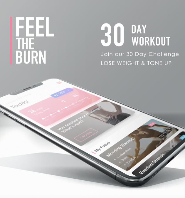
At Akin, we frequently shifted gears and developed one-off mobile apps as we identified new markets. After successfully launching and maintaining a recipe app, we pivoted to the then-blossoming field of home exercise tools. I served as both UX Researcher and Creative Director on Feel the Burn (and later, the gender-neutral Fit O’Clock) as part of a small product team.
As we began building an exercise app, we knew that we needed to differentiate our product from the competition.
Problem
A number of high-profile exercise apps had launched or gained traction in the months leading up the launch of our app, Feel the Burn, in 2018. Many of these had slick production values and dedicated user bases.
If our app was to succeed, we needed to identify, understand, and serve a unique niche of users.
Solution
Through a combination of on-the-ground discovery research, interviews, and market analysis, we identified a segment of the population — women aged 35-50 — that was underserved by the market of exercise apps. Once a prototype was built, we maintained research with this demographic as we continued to refine our product.
Over the following year, Feel the Burn saw over a million installs in the Google Play Store, with an average rating of 4.6 stars out of 5.
Methods
- Competitive Analysis
- Field Studies
- Personas
- Card Sorting
Pre-Launch
Competitive Analysis
Before beginning development of Feel the Burn, we wanted to assess the current consumer environment vis-a-vis existing offerings.
Key Questions
- Is there a demographic gap in the marketplace of exercise apps?
- Do any elements of existing, popular exercise apps alienate any key demographics?
- Given the wealth of options available, what barriers remained in place that prevented people from reaching their health goals?
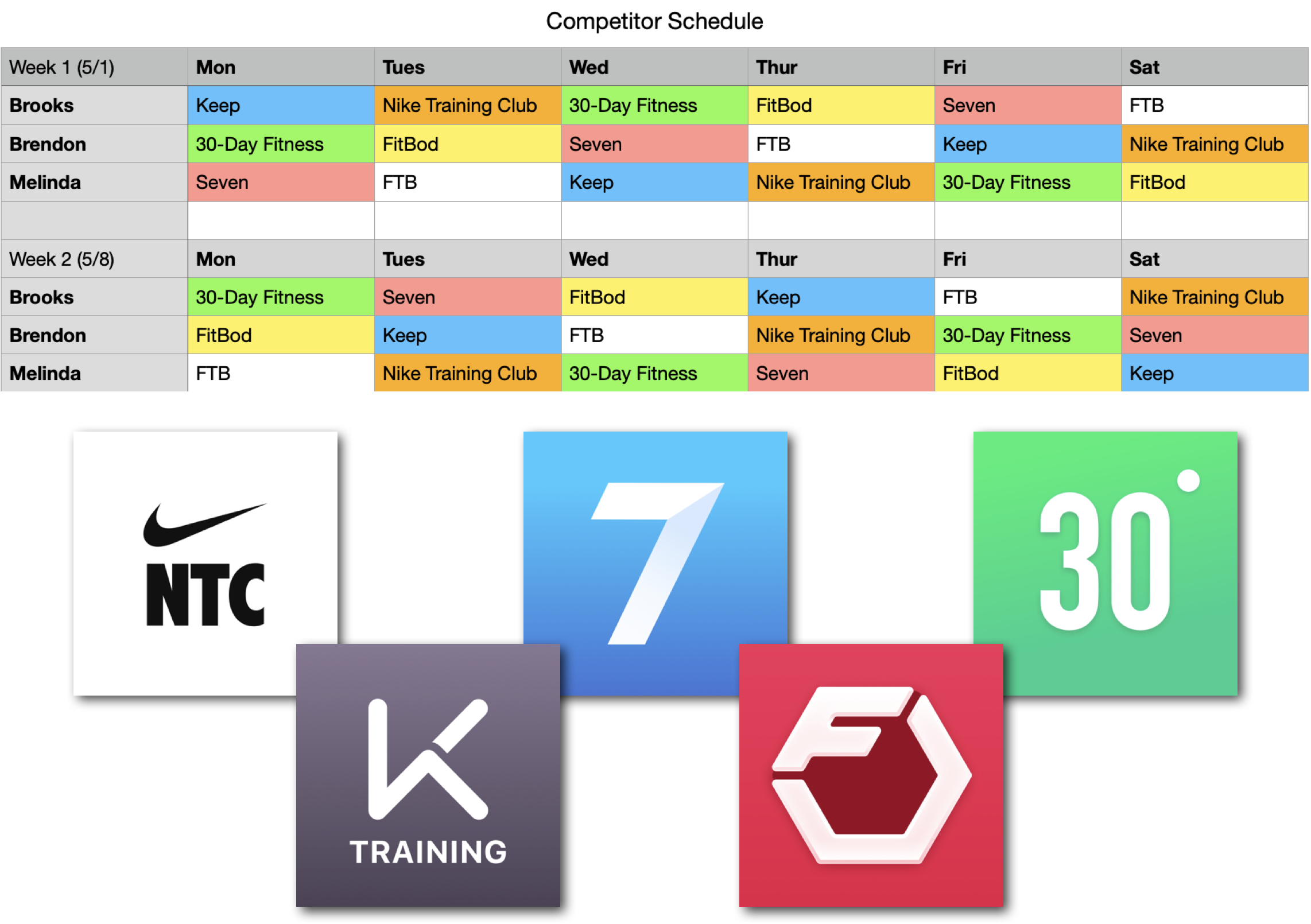
Five competitor apps were chosen for analysis based on data from AppAnnie: Nike Training Club, Seven, 30-Day Fitness, Keep, and FitBod.
Three participants (myself, a PM, and an intern) used these apps on a randomized schedule 1-2x/day over the course of two weeks. Notes and experiences were collected by all study participants.
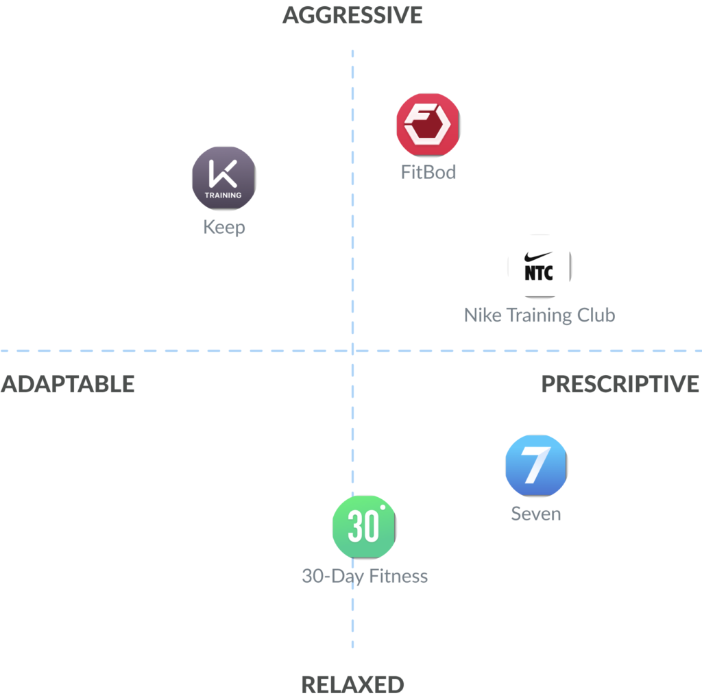
SWOT Analysis
These five apps were assessed with regard to the strengths, weaknesses, opportunities, and threats (SWOT) in a two-hour workshop at the conclusion of our competitive analysis.
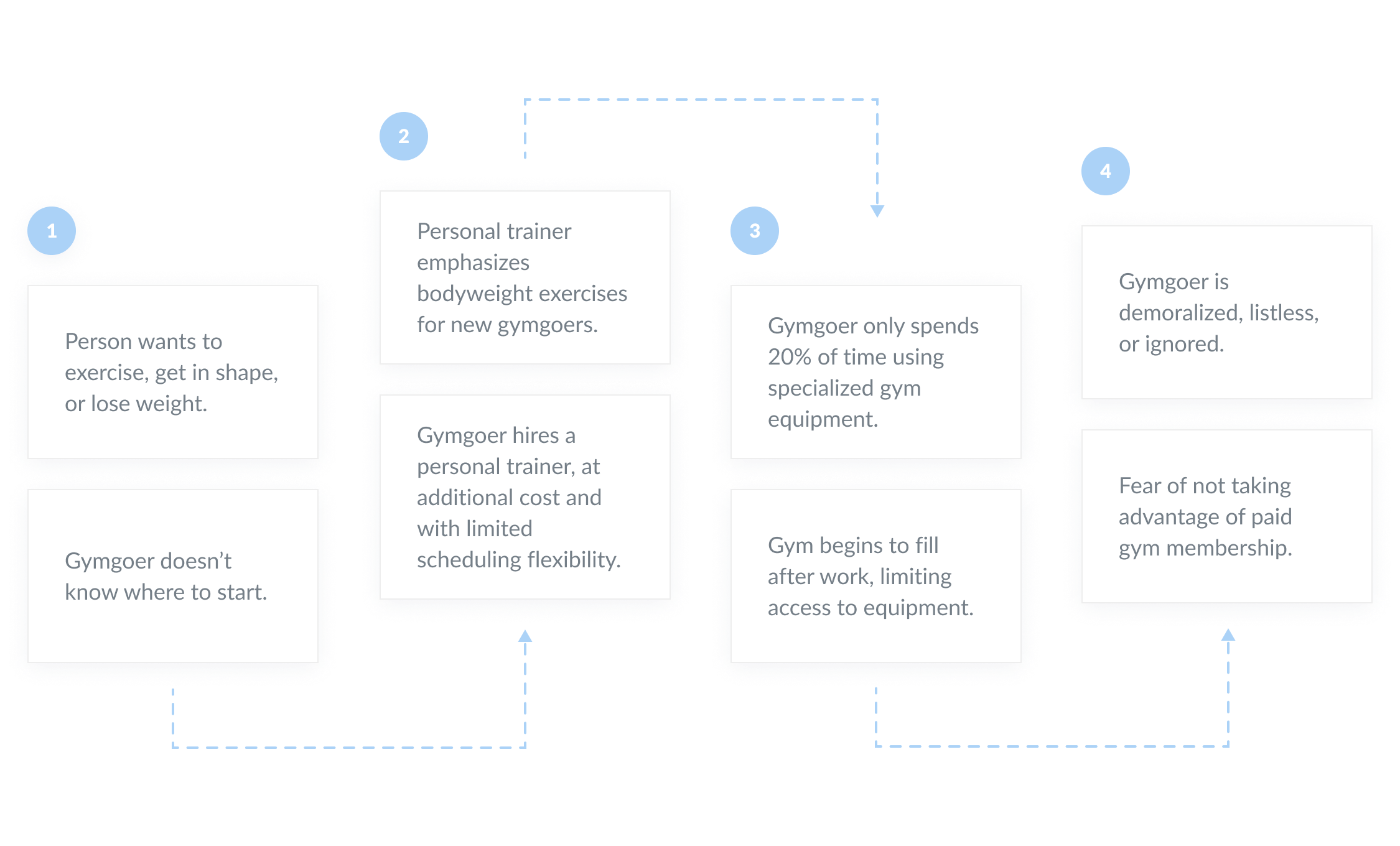
A general weakness, noted across all competitors, was the limited implementation of accessibility options, if any. This formed one access of our assessment: Adaptable/Prescriptive.
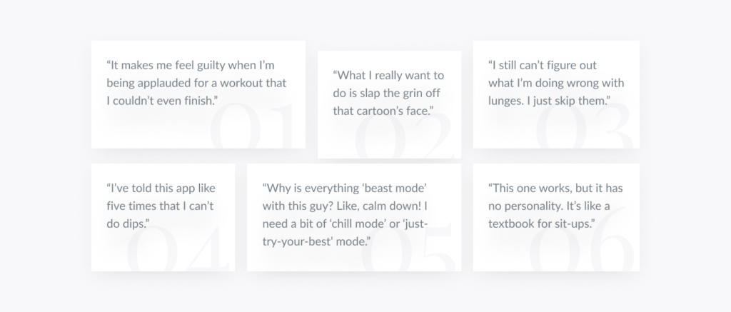
Example: While FitBod allowed for exercise substitutions, these choices were not retained the next time a user began a workout, and the other apps had no substitution options at all. One participant pointed out that she had to just sit through exercises (particularly dips) that required a couch or stool, as she did not have any surface in her room that was suitable.
The other axis, Relaxed/Aggressive, concerned the subjective tone and UX of the app. Most exercise apps on the market were characterized by a stereotypically masculine, high-energy, personal trainer-like experience that all participants found somewhat aggressive. Relatively few apps fell on the opposite end of the spectrum, and even then were noted only for their distinct lack of personality.
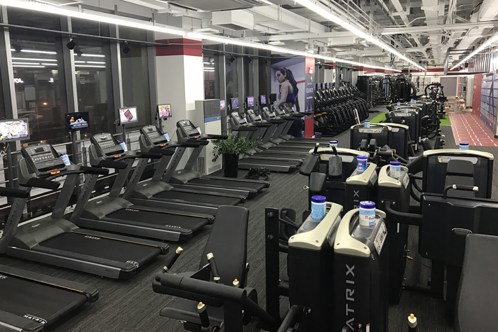
Field Studies
Taking advantage of the “free trial” period offered at most gyms in Shanghai, two members of the research team each enrolled at local gyms, with the third participant already being a member of an all-women gym near her home.
The researchers were instructed to simply observe and take notes on the demographics represented at their gyms, what exercises/equipment they were using, and any perceived difficulties or frustrations they may be experiencing. Researchers were also asked to make note of what personal trainers were teaching their clients, and who those clients were. We each visited our respective gyms at multiple times throughout the two-week period, ranging from early in the morning to late at night, on weekdays and on the weekend.
At the conclusion of the study, one team member collected and sorted the observations into categories based on sex, approximate age, assumed fitness level, and whether or not a personal trainer was present.
(Note: This stage represented a mild ethical concern, given that we undeniably did not intend to continue with these gyms past the “free trial” stage of our memberships.)
Post-Launch
Personas
Persona Creation Workshop
In the eight weeks following the launch of Feel the Burn, we formed a Facebook group for users of the app, allowing us informal access to many of our most passionate advocates. We began a series of email surveys and carried out interviews with over twenty current and prospective users, many of whom were sourced directly from the Facebook group. We also had extensive user path data through Flurry Analytics, which was integrated into our codebase from the start.
As we continued to iterate on the initial design, we had to make some difficult decisions as to who would be best served by our app, and how we could ultimately monetize it beyond being ad-supported. We decided that we needed a set of personas to unify our development efforts.
10 people participated in the persona creation workshop:
- All key members of the design and development teams (8 people)
- One graphic designer
- One marketing specialist
Prior to the two-hour workshop, an intern and I collected quotes from the Facebook group (where we had seeded conversation), user interviews, and surveys, along with what Flurry identified as our five most prominent user paths. This information was displayed, removed from context, in a slideshow at the beginning of the workshop.
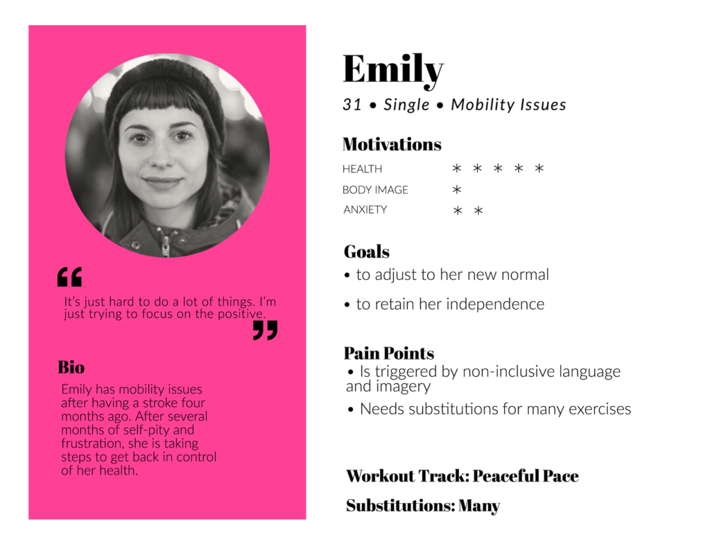
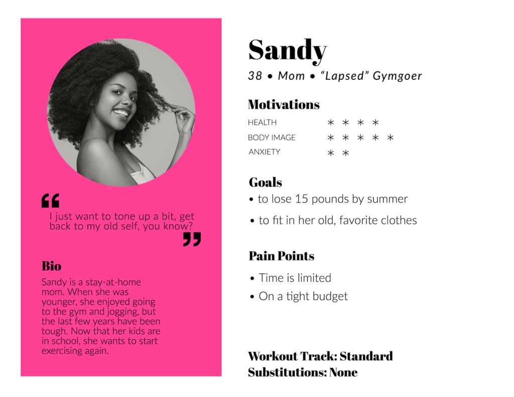
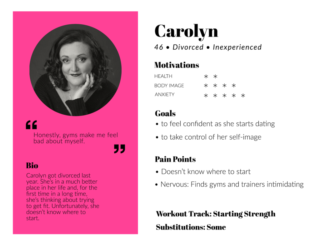
All present collaborated, initially synthesizing six personas, before distilling these further into three main archetypes: Carolyn, Emily, and Sandy.
Persona Qualities
We chose to focus on the following commonalities for the purposes of persona creation:
- Age
- Marital/relationship status1
- Fitness experience
- Motivations for using our app:
- Health
- Body Image
- Anxiety (aversion to going to a gym)
- Goals
- Pain points
- Workout Track (which routine they gravitated toward)
- Substitutions (made to exercise routines for mobility or other limitations)
These qualities were needed to represent, where permitted by data available, at least 20% of our user base to constitute a persona.
- Relationship status was included because of how frequently it was mentioned in survey responses by women who wanted to focus on themselves after divorce or a breakup. ↩︎
In addition to being a clarifying, user-oriented activity, Persona Building functioned beautifully as a unifying tool for the team. Creating the three personas revealed and calmed the concerns of team members while simultaneously ensuring that we were all on the same page.
This process also eliminated a huge burden of potential work: Focusing on a certain type of audience meant eliminating a huge number of potential pitfalls, such as paying to produce demonstration videos for exercises that would never be of use to our users.
Card Sorting
To make sure that the our app’s information architecture (including difficulty levels and terminology used) was aligned with user expectations, we recruited six users from the Facebook group for remote, 30-minute card sorting sessions. Our CSR team was also able to recommend four users who had been proactive suggesting changes to the app via email, bringing the total participant count to ten.
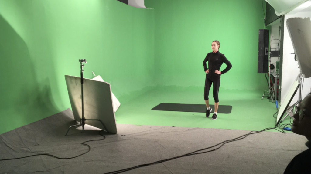
Using Skype, we displayed a variety of exercises (3-10 second clips from YouTube) and asked participants to answer a short series of questions. This was repeated 65 times — once per each exercise planned to be included in the app.
Exercise Difficulty
After displaying the video of the exercise in question, we asked the following:
How would you rate this exercise?
- Easy
- Manageable
- Difficult
- Impossible
Exercise Names
Once the exercise had been assigned a difficulty rating, we followed it up with any variation of the following:
- OK, and what would you call that exercise?
- Cool — but what was that move called?
- Alright, and out of curiosity, what name would you give to that movement?
If the name given by the participant differed from our internal terminology, a note was made.
Card sorting revealed massive disconnects between “expert” vocabulary and that of our users. Most users did not have clear terminology for the exercises demonstrated, meaning that the “substitutions” menu would need to be revised in a more image-forward direction.
With the data from card sorting applied to our list of exercises, we realized that our assortment of exercises was not nearly comprehensive enough. Internally, we had difficulty ratings assigned to each movement, as well as a tag for which muscle group it worked out (in order to keep workouts balanced). Over 50% of our initial sampling of 65 exercises were regarded as either “Difficult” or “Impossible” by at least 50% of our users.
This process also revealed the sheer number of exercises that were functionally impossible for populations with mobility issues. Of the 65 exercises presented in the study, only 22 were manageable by all participants.
Results
Research led directly to the development of key features, including:
- Supportive, non-judgmental tone
- Accessibility options from Day 1
- Video exercise demonstrations
- Step counter
- Recipes & meal plans, including nutritional info pulled from the USDA.gov API
- Localization: Spanish, Chinese
We gained over 1,000,000 installs, with 235,000 monthly active users at peak, and a 4.6 rating on the Google Play Store.
Three months later, we launched a more gender-neutral version of our exercise program called Fit O’Clock, which reused many of the assets created for Feel the Burn.
I objected to much of the language used in the trailer (as it was fundamentally counter to the non-judgmental attitude espoused in the app), but was voted down due to those terms and phrases scoring well in marketing analysis.
Personal UXR Takeaways
- Identifying an audience is key at the start of any project, but maintaining empathetic momentum — consistently seeking a greater understanding of your user base — over the course of development is what sets apart a good user experience from a great one.
- Accessibility options are almost impossible to add into a product after the fact. It must be implemented from the start.
- Principle of Least Astonishment: Give people what they expect 99% of the time. Save the surprises for when it really counts.
- People want to help. If you can build a dedicated audience of folks who know that you are their advocate, you can get incredible feedback.
Thank you for reading my case study!
If you think that I could be an asset to your organization, or you are looking for a partner in a new venture, please do not hesitate to reach out.
Storytelling — humanizing data and abstract information — is what I love to do.